Categories
Design

Color: Its characteristics and research

Color is one of the most captivating aspects of our sensory experience. It is not only an aesthetic tool in design, fashion, art, and nature but also plays an important role in how we perceive the world around us.

Throughout history, the study of color has evolved significantly through scientific research. These studies have uncovered the complex mechanisms behind the generation and perception of color.

What is Color?

Simply put, color is a visual perception created when objects interact with light. It is the result of how objects either reflect or emit light, and how that light is absorbed or reflected by our retinas.
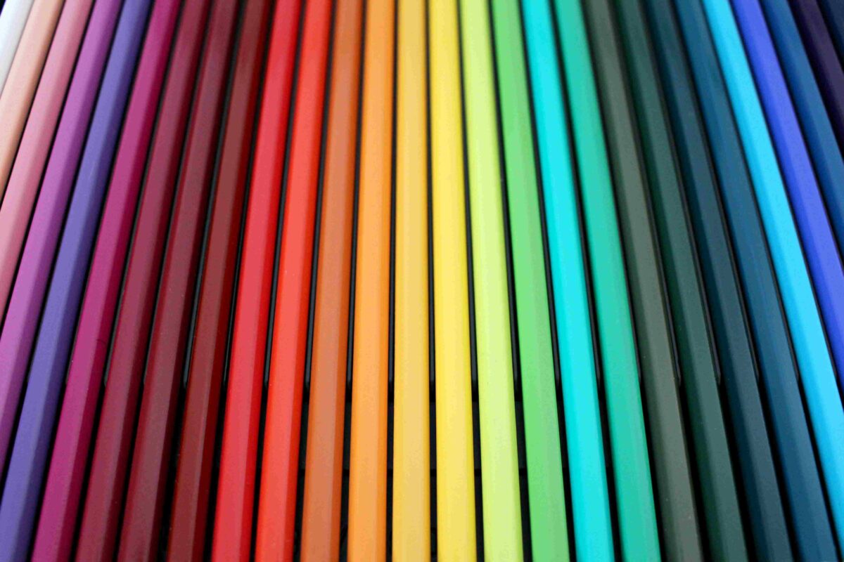
Color

Color is not inherent to objects; it depends on how our eyes interpret the wavelengths of light.

According to research conducted by Isaac Newton in 1666, white light, such as sunlight, is a mixture of different wavelengths corresponding to the colors of the visible spectrum. In the 19th century, scientists like Thomas Young and Hermann von Helmholtz expanded on these concepts and proposed the theory of trichromatic vision, which shows that humans perceive color through three types of cone cells in the retina that react to different wavelengths of light: red, green, and blue.

Characteristics of Color

Color has several characteristics that determine how we perceive it:

  1. Hue (or tone): The basic property that defines colors as red, blue, green, etc. This is related to the wavelength of light. For instance, shorter wavelengths correspond to blue or purple colors, while longer wavelengths correspond to red or orange colors.
  2. Saturation: The intensity or purity of the color. High saturation colors appear vibrant, while low saturation colors appear muted or grayish.
  3. Brightness (or luminance): The amount of light reflected by the color. Brighter colors have high luminance, while darker colors have low luminance.
  4. Value: The lightness or darkness of a color. Adding white lightens the color, and adding black darkens it.
  5. Chroma: Related to the purity of a color, determined by its mixture with primary or secondary colors.

How We Perceive Color

Color perception is a complex process that involves both the physics of light and the biology of the human eye. When light hits an object, certain wavelengths are reflected based on the object’s properties (such as texture and composition). These light stimuli are received by the cone cells in the retina and then sent to the brain, where they are interpreted as color.

Research by James Clerk Maxwell in the 19th century and later by Hermann von Helmholtz helped establish the idea that light can be broken down into different colors, and these are perceived by the human retina in distinct patterns.

In recent years, devices like displays and digital cameras have mimicked this process, interpreting light wavelengths and converting them into the colors we perceive.

However, color perception is also influenced by subjective and cultural factors. John DeRayney (2009) argued that the perception of color can vary depending on emotional, cultural, and even psychological factors, meaning that the same color might be interpreted differently in different contexts.

For example, red might symbolize passion or warning in some cultures, while in others, it might represent good luck.

The Science of Color

Colors Perceived in the Real World

Key Studies

In 1873, physicist Helmholtz defined the trichromatic theory, showing that the perception of color is related to the three types of cone cells in the retina. This laid the foundation for color perception research.

Wald & McNichol (1960) measured how the cones in the eye react to different wavelengths of light and uncovered specific patterns in color perception.

Furthermore, Simon Simon‘s studies on “color sense” explored how color impacts emotional states, revealing the psychological effects that color has on us.

Conclusion

Comprender la percepción y el reconocimiento del color es un elemento importante que abarca la ciencia, la psicología y la cultura. El color influye profundamente en nuestros sentidos y puede provocar cambios emocionales y cognitivos significativos.

Comprender cómo usar el color y su fundamento científico es esencial en campos como el diseño, el arte y la vida cotidiana.

Categories
Design

What is branding? The truth

What is branding? Good, is to manage the reputation of the brand in a few words give life visually with the design, but with a management solid strategy on what you want to convey very well planned from the beginning, as well as it shows a brand to the audience, it’s like his face.

Delving into what is branding

Branding is a discipline, multi-faceted, therefore, requires the collaboration of several departments within a company to create and maintain a brand identity is consistent and effective. In the first place, the marketing department leads the overall strategy of branding, developing campaigns, messages and materials that, in turn, reinforce the image of the brand in the market.

Departments are required to develop a branding successful

Graphic design is responsible for the creation of visual elements such as logos, fonts, and colors, ensuring that all visual aspects of the brand are attractive and consistent. Communication and public relations to manage the public perception of the brand, building relationships with media and public to ensure a positive image.

The product development department works on the alignment of the branding with the features and benefits of the product, ensuring that the value proposition is communicated effectively.

Finally, the human resources department plays a crucial role to integrate the culture of the brand within the company, ensuring that employees live and reflect the values of the brand in their daily interactions. Together, these departments work together to build a brand identity is solid and consistent that resonates with consumers and strengthen the company’s position in the market.

Types of Branding and their examples

Below you can see a list detailed, but simplified and with examples so you can better understand each of the types of branding that currently exist.

Branding Corporate

Description: refers to the branding of the company as a whole. Focuses on building and maintaining an image and positive reputation for the company as a whole, beyond its individual products or services.

Example: Apple Inc.

Description: Apple stands out for its focus on innovation, the elegant design and simplicity. Your branding corporate is focused on brand identity strong that conveys quality, sophistication and a modern lifestyle.

Date: Since its foundation in 1976 until the present day.

Branding of Product

Description: This type of branding focuses on creating a specific identity for a particular product. The aim is to highlight the unique characteristics of the product and to create an image that sets you apart from other similar products in the market.

Example: Coca-Cola

Description: The branding of Coca-Cola for their drink is iconic, with a logo that is recognizable, a distinctive color (red) and a partnership with happy moments and refreshing. Each advertising campaign and packaging reinforces this image.

Date: From 1886 to the present.

Branding Service

Description: Focused on the services offered by a company instead of physical products. Focuses on the experiences and the value that the service provides to customers.

Example:Uber

Description: Uber has created a strong brand identity for your service transport, highlighting the convenience, accessibility and innovation in the urban mobility. Their branding focuses on ease of use and reliability of the service.

Date: Founded in 2009 and is still evolving.

Personal Branding

Description: This type of branding focuses on the creation of an identity and a personal reputation, often used by individuals who wish to excel in their professional fields or creative.

Example: Oprah Winfrey

Description: Oprah has built a personal brand solid based on empathy, empowerment, and success in the media. His name and image are associated with values of authenticity and motivation.

Date: From the 80’s until today.

Branding Brand (or Branding-Line)

Description: Involves the creation and management of the identity to a specific line of products under the brand name more widely. It is an identity that is consistent for a number of products that belong to the same category.

Example: Nike Air Max

Description: Nike has created a distinctive identity for its line of shoes Air Max, highlighting the damping technology and sporty style. Each model within the line maintains a consistent image, but with specific characteristics.

Date: Launched in 1987, and continues to develop new versions.

Branding Experience

Description: This type of branding focuses on the overall experience that customers have with the brand. Includes all the points of contact and interaction with the brand to create a memorable experience and positive.

Example: Disney

Description: Disney offers a brand experience that encompasses theme parks, movies, products, and more. The brand is known for creating unforgettable experiences, and magical to people of all ages. Date: From 1923 to the present.

What is audio branding?

¿Qué es el audio branding?

It is the practice of using sound elements to build and strengthen the identity of a brand. In the first place, it focuses on the creation and integration of specific sounds, such as jingles, sound effects, or melodies, which are associated uniquely with a brand.

These items are hearing is for the purpose of improving the recognition of the brand and evoke positive emotions in the consumer.

Not only limited to commercial radio or television. it also covers the music and sounds used in ads, apps, websites and point of sale.

The idea is to create a listening experience consistent strengthen the visual identity of the brand and create a connection memorable with the audience.

What is the study of the branding?

¿Qué es el estudio del branding?

It is a discipline that focuses on analyzing how to build, manage and maintain an effective brand.

In the first place, the study of the branding investigates the fundamental components that constitute a brand identity, including the creation of visual elements such as logos and color schemes, as well as the development of key messages that resonate with the target audience.

Overview on what is branding

The branding is a key skill and a valuable resource for companies. Allows brands to dressing, identify and differentiate yourself in the market. Is manifested both in the digital world as in the real world, and are complemented with advertising and marketing strategies.

Categories
Design

The Psychology of Color: Impact and Applications

The psychology of colour is not only a discipline fascinating, but a powerful tool in the design and visual communication. Explore how colors affect our emotions and perceptions is crucial to design experiences that resonate with audiences.

In this article, we’ll dive deep into the psychology of color, highlighting its impact on the human perception, how to use it effectively, and in what areas it is applied, based on the book ‘The Psychology of Color: How do Colors Affect the Perception and Emotions’ Eva Heller.

The psychology of colour also plays a crucial role in the design of brands and advertising, and the color can directly affect the perception of a company or a product.

For example, red can transmit energy or urgency, which makes it ideal for promotions and sales, while blue is associated with trust and serenity, which is why so many brands use it to convey security.

In addition, the combination of colors it can produce different visual effects, and emotional, so understanding how to balance them properly is critical to achieve effective visual communication.

This is especially useful not only in graphic design, but also in marketing, where the colors can impact the purchasing decisions and customer loyalty.

Origins and Development

The exploration of the effects of color on human beings has a long history. The first observations on the impact of color is traced to the ancient cultures, where the colours were associated with certain meanings and healing properties.

With time, scientific studies have delved into how the colors affect the emotional state and decision making.

In the TWENTIETH century, psychology moderna began to systematize these studies. Johann Wolfgang von Goethe, in his work ‘Theory of Colours’, and later Max Luscher, with his ‘Test of Color Luscher’, carried out fundamental research that helped to understand how color can influence our perceptions and behaviors.

Approach and Correct Use of the Psychology of Color

The approach to the psychology of color means using the colors in a conscious manner to achieve a desired effect. To use the psychology of color effectively, it is important to follow these principles:

Know the Context:

Colors can have different meanings depending on the cultural context and the goal of the project. For example, the color white can symbolize purity in some cultures, while in others it may be associated with mourning.

Understand the Target Audience:

It is crucial to understand how your audience perceives and responds to the colors. This will allow you to choose the colors that best align with their expectations and emotions of such business or brand.

Applies the Theory of Color:

Use color theory to create harmony and contrast in your designs. The effective use of the color wheel and the color combinations can improve the readability and visual appeal of your project. Like to help you to choose the best colors that you are better in the dress.

Each color has a range of emotional effects, and perceptive. Understanding these effects will allow you to use color in a strategic way:

Red color psychology: Energy and Urgency

The color red is associated with energy, passion and urgency. This color can increase the heart rate and blood pressure, evoking intense emotions. In marketing, the red is used to capture the attention and stimulate a rapid response.

Examples of Brands that Used the Red:

Coca-Cola: Use the red to convey energy and enthusiasm, creating a sense of urgency in your sales campaigns.

Netflix: The red in their logo suggests dynamism and emotion, in line with the experience intense and entertaining that offers its platform.

Blue color psychology: Calm and Confidence

The blue communicates calm, confidence, and serenity. It is a color widely used in corporate environments and professionals to project stability and professionalism. In addition, the blue can help reduce anxiety and promote a sense of tranquility.

Examples of Brands that Used the Blue:

IBM: Your logo blue reinforces the confidence and stability, in line with his image as a technology company with strong and reliable.

Facebook: The blue of your interface transmits calmness and confidence, creating a peaceful environment for social interaction.

Green color psychology: Nature and Balance

The green is associated with nature, balance and freshness. In interior design, green is used to promote a relaxing environment and healthy. It may also help the rejuvenation and a feeling of well-being.

Examples of Brands that Used the Green:

Starbucks: The green in their logo symbolizes the freshness and the connection with nature, in line with its image as a company that values sustainability and well-being.

Whole Foods: Use of green to highlight its focus on natural and organic products, appealing to the eco-conscience of your customers.

Yellow color psychology: Happiness and Optimism

The yellow evokes happiness and optimism. However, it should be used with moderation, as too much yellow can cause anxiety. In the graphic design, the yellow is used to attract attention and generate a feeling of joy and energy.

Examples of Brands that Used the Yellow:

Mcdonald’s: The yellow in your logo and design restaurants is meant to attract customers with a feeling of joy and energy, making them feel welcome.

IKEA: Use yellow to highlight special offers and promotions, generating a sense of optimism and urgency in their campaigns.

Appeal to the Emotions of the Consumer

The colors can be used to evoke emotions to specific consumers. By understanding how the colors affect to the motivations and feelings, you can create marketing campaigns more effective and persuasive.

Other Popular Colors

In addition to the above-mentioned colours, there are other colors that also play an important role in the psychology of color:

  • Orange: often associated with enthusiasm, creativity and vibrant energy. Brands such as Fanta and Reebok used the orange to capture the attention and fostering a sense of fun and dynamism.
  • Purple: Associated with royalty, creativity and luxury. Twitch and Hallmark used the purple to convey sophistication and originality.
  • Black: Means elegance, power, and sophistication. Chanel and Nike used the black for projecting an image of luxury and authority.
  • White: Associated with purity, simplicity and cleanliness. Apple and Tesla used the white to convey modernity and elegance in their designs.

The psychology of color are applied in various industries to take advantage of its emotional impact and perceptual:

Graphic design and Advertising: The graphic designers use color to attract attention, convey messages and encourage action. Colors may affect the perception of a brand, and in the effectiveness of the advertising campaign.

Interior and Architecture: the design of interiors, the colors are selected to create environments that influence the mood and functionality of the spaces. For example, the shades of blue and green are common in work environments to promote concentration and tranquility.

Fashion: In the fashion industry, the color communicates style and personality. Fashion designers choose colors that reflect trends and prevent the design become obsolete quickly.

Branding and Marketing: companies use colors to build a brand identity consistent and to influence purchase decisions. Colors can evoke emotions that are aligned with the values of the brand and the desires of the consumer.

Interaction and Perception

The combination of colours can alter your perception and effectiveness. Use combinations harmonious or contrasting can influence how you feel and reacts to the viewer in front of the design. Experiment with combinations can enhance the visual communication.

Trends in color and their perceptions evolve over time. Be aware of the current trends can help you to design in a way that is relevant and attractive to audiences modern.

Color influences the usability of digital interfaces. Colors are well chosen can improve navigation and user interaction, while elections inappropriate may confuse or frustrate.

Design the psychology of color in mind optimizes the user experience.

Categories
Design

Mockups. what it is, tips and advice for a designer

If you want to know what a mockup is and how you can make them, you are in the right place. You should know what options you have to make mockups and the importance of creating one. It is important that you don’t believe that only by creating, this is a powerful tool visually to see the final creation, but must also conform to optimal function, that adds value, that you follow the design guidelines and the customer, as well as the implementation makes sense in the project in which this work.

It is a visual representation of a design in a realistic context. This model, often in a digital format, shows how to see a finished product, whether it be a logo on a business card, an application on a mobile device, or a container in a shop. They are essential in the design process because they allow you to visualize the design in its final form before the production, making adjustments and prior approval.

How can I Make the Mockups?

Create a mockup can vary in complexity depending on the approach and the tools used. In general, follow these steps:

1. Choose a Template: typically, designers start with templates, pre-made that mimic the format of the final product.

2. To incorporate the Design: Is added to the design (such as a logo or graphic) on the template using design programs.

3. Set Details: adjustments Are made so that the design looks natural in the context of the mockup.

4 Review and Finalize: We review the mockup to ensure that all elements are properly represented.

Key advice for Designers: Choose the Mockup Suitable

As a designer, you know that the first impression can make or break a presentation. Opt for a mockup professional, preferably bright, and with a little color, it is critical to convey a positive image consistent with your proposal, remember to consider the color palette, and maintain visual consistency, this will not only help your message resonate with the audience, but also reinforces your professionalism to deliver a work that is viewed with quality.

While the mockups free of charge are accessible, invest in payment options can make all the difference in the originality and quality of your work will affect the budget but well worth it. Prioritizes always an approach that reflects your creativity and vision, and you will be on the right way to impress your customers and give good results.

How did it come about in the design?

The concept of mockup emerged at the end of the NINETEENTH century, when designers began to create visual representations of products and designs to facilitate communication with customers and partners. Although not attributed its creation to a single person, its use was popularized with the advent of printing and the graphic design modern.

Programs to Create Mockups

The mockups can be created with various tools, each with its own level of difficulty:

  • Adobe Photoshop: Ideal for creating mockups detailed with a wide range of tools. It is more complex and requires previous experience.
  • Adobe Illustrator: Useful for mockups based on vectors. Has a learning curve similar to Photoshop.
  • Figma: Perfect for mockups, interactive and collaborative. Relatively easy to use, especially for designers of interfaces.
  • Sketch: Popular with designers of interfaces for creating mockups and prototypes. Easy to learn and use.
  • Placeit: online Platform that offers a wide variety of templates mockups. Very easy to use, ideal for beginners.
  • Mockup World: Another online resource with downloadable templates. Useful for those who are looking for options fast and simple.

These are some programs that eh used and are very efficient to create mockups, that’s why we recommend it.

Examples of Mockups in Real Life

  • Packaging: How to see a design of packaging in the shelf of a store.
  • Advertising: Presentations of how an ad will look on different media.
  • Applications: Simulation of how an app will look on different devices.

As you can appreciate its use is focused on different areas in which you may require.

Why is it Important to have a Good Design Mockup?

A good mockup has a significant impact on the design process and in the perception of the product in its final phase. We add value as designers or to the general equipment, it is crucial for the following:

Display the Final Product:

Allows you to see how to see the design in its final form before the production.

Facilitates the Approval:

Helps to get the approval of the client or team to show a design in a realistic context.

Improving the Presentation:

A mockup well designed can make the work look more professional and attractive.

What Should I Include in a Mockup Finished?

A mockup is finalized should be a clear representation and attractive design that will you want to display. Here I detail the key elements that can’t miss:

Design Principal: This is the central element of the mockup, as a logo, a graphic, or a user interface. Must be well-integrated and be easily recognizable.

Realistic context: The mockup you must submit the design in an environment that simulates actual use. For example, a container on a coffee table, or an application on a smartphone.

Visual quality: The images must be high resolution and the finish should be professional. This includes shadows, reflections, and textures that enhance the design.

Descriptive text: to Add a brief description of the design and your purpose helps contextualising it. This is especially useful in presentations.

Interactivity (if applicable): For mockups, digital, include interactive elements, such as buttons that can be pressed, can show how it will actually work the design.

Learn how you can give life to your ideas with your own mockups.

Categories
Free tools

The Best Apps for Graphic Design in Mobile and iPads

Design on-the-fly has never been so easy thanks to the mobile applications, and iPad that offer powerful tools to create stunning graphics. Whether you’re in search of a quick retouch or a complete design, these applications for Graphic Design in Mobile will provide you with everything you need directly from your device.

Then, here are the six best apps of graphic design for smartphones and iPads in 2024, along with their features and links for you to download them easily.

What are the Applications for Graphic Design?

1. Procreate

Features:

  • Advanced tools for drawing and digital painting.
  • Support for layers and brushes custom.
  • Intuitive interface and adaptable for iPad.

Uses in Design: Ideal for detailed illustrations, sketches and digital painting on an intuitive platform.

Download: Procreate

2. Adobe Fresco

Features:

  • Drawing and painting tools with a natural experience.
  • Support for brushes raster and vector.
  • Integration with Adobe Creative Cloud.

Uses in Design: Perfect for artists and designers who seek an experience of drawing fluid and professional on the iPad.

Download: Adobe Fresco

3. Affinity Designer for iPad

Features:

  • Design vector and bitmap on a touch interface.
  • Professional tools for illustrations and graphics.
  • Synchronization with the desktop version of Affinity Designer.

Uses in Design: Ideal for creating vector graphics, and detailed designs with precision on a mobile platform.

Download: Affinity Designer for iPad

4. Canva

Features:

  • Wide variety of templates and design tools are easy to use.
  • Drag and drop functionality for creating graphics and presentations.
  • Access to a library of images and graphic elements.

Uses in Design: Perfect for creating graphics for social media, presentations and other visual materials quickly.

Download: Canva

5. Adobe Spark Post

Features:

  • Quickly create graphics and publications for social networks.
  • Templates and intuitive design with customization options.
  • Integration with Adobe Creative Cloud.

Uses in Design: Excellent design publications appealing to social media and marketing quickly and easily.

Download: Adobe Spark Post

6. SketchBook

Features:

  • Professional drafting tools and bocetaje.
  • Layer support and a wide range of brushes.
  • User-friendly interface for a seamless user experience on tablets.

Uses in Design: Perfect for a quick sketch and detailed drawings with a variety of design tools in a mobile environment.

Download: SketchBook

My Recommendation to select Applications for Graphic Design

If you are looking for a robust tool for illustrations and digital painting, Procreate and Adobe Fresco are options outstanding that offer a professional experience on your iPad. For those who need a complete solution for design vector on a mobile format, Affinity Designer for iPad is an excellent choice.

On the other hand, if your focus is on creating charts quickly to social networks or presentations, Canva and Adobe Spark Post are tools that are accessible and effective. SketchBook is a fantastic option for sketches and detailed drawings at any time.